A Colorful Life
“What’s your favorite color?” A common question. Mine is purple (and its soulmate, aubergine). Colors effect everything from clothing and home interiors, to nature’s gift of seasonal landscapes and brilliant sunsets.
In photography and art, color is a science. Color wheels illustrate it. There’s complimentary (two colors that are on opposite sides of the color wheel), primary (red, yellow, blue), secondary (a mix of two primary colors), tertiary (a secondary color combined with a primary color), warm, cool, monochromatic, analogous, triadic, and tetradic. Whew! Circular complexity.
I focus more easily on the “psychology” of color, a science about how perception and emotional triggers work together. My hope is for viewers to feel their own emotional “color” connection to a visual subject.
In the words of French painter Fernand Leger (On Monumentality and Color, 1943), “The craving for color is a natural necessity just as for water and fire. Color is a raw material indispensable to life. At every era of his existence and his history, the human being has associated color with his joys, his actions and his pleasures.
In my “Warm Dreams” (image below), yellow has the starring role. After disassembling flowers into petals and pistils to create an original composition, then photographing it, I enabled its bold color palette to emerge. According to the “psychology” of color, yellow symbolizes hope, happiness, and positivity. Pops of green are associated with harmony, life, and renewal. Flares of orange uplifts the image further, representative of energy.

Fine art quality prints of “Warm Dreams” are available here.
Sometime the color palette choice is not as absolute as “Warm Dreams.” For example, “Birds and Petals” and “Paris Bird Market” (images below) each began with a photograph captured during a wonderful day at the Paris Bird Market in 2015. From a negative, I produced a cyanotype print (using chemicals and UV light), adding layers of living flowers. The composition is inspired by Andy Warhol’s Flower Series, although not derivative. When revisiting this piece. I had a gnawing urge to “play with” the color palette some more, which became “Paris Bird Market,” an alternative version.


Fine art quality prints of “Birds and Petals” are available here.
Fine art quality prints of “Paris Bird Market” are available here.
The same is true of “Birds in the Cherry Blossom Trees” and “Cherry Blossom Fantasy.” From my original photograph of Cherry Blossom trees, the image was printed on transparency film as a primary overlay, adding beneath it watercolor-like birds and a graphic design. Once again, I could not settle on just the original color scheme.
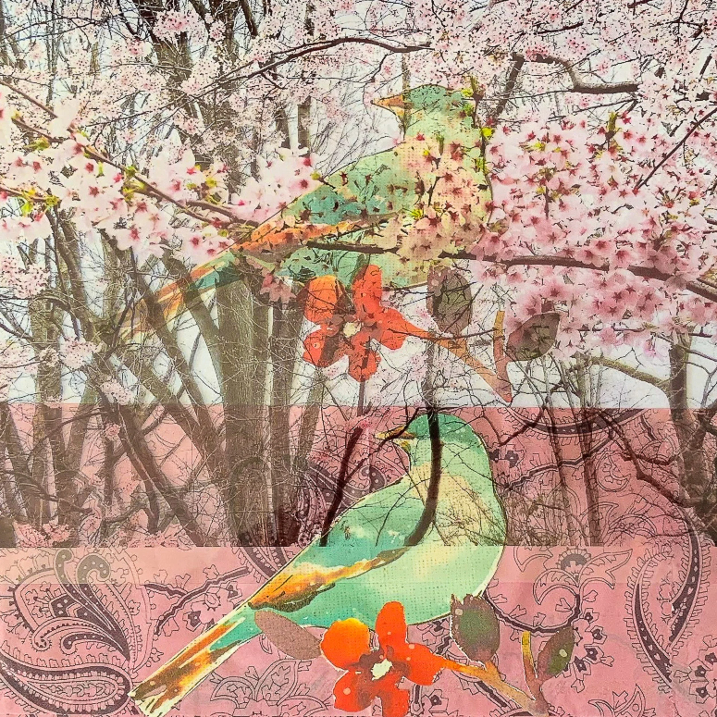

Fine art quality prints of “Birds in the Cherry Blossom Trees” are available here.
Fine art quality prints of “Cherry Blossom Fantasy” are available here.
The biggest takeaway (based on reactions from of clients, friends, and the art community) is that individual perception determines what emotional connections arise from color and subject – different for everyone. Floral compositions have been a subject used in art for millennia. These abstracts seek to stretch that tradition with unexpected floral elements that also rely on other wonders of nature.
I am delighted that “Warm Dreams” has been selected for the curated exhibition, “Be Bold,” on display and on sale at the CFA Gallery in Glen Head, NY (70 Glen Head Road) from September 25 – November 4, 2022. The Artist Reception and Awards Presentation takes place on October 15 from 3:30-5:30 p.m. All are welcome.
We can all be creators, in whatever form that takes.
Sharon